You drag the contrast slider until the picture looks right, then stop. Ask why you stopped there and there’s usually no answer.
That works until you’ve posted ten videos and none of them look like they came from the same person. Contrast decides both how a video feels and whether anyone can read it at thumbnail size, and it’s the setting most creators adjust by feel and never actually decide on.
Contrast is the distance between the brightest and darkest parts of a frame. Low contrast means that distance is small: shadows stay open and transparent, highlights never reach pure white, and most of the image sits in the midtones. High contrast means deep blacks, bright highlights, and a fast jump between the two.
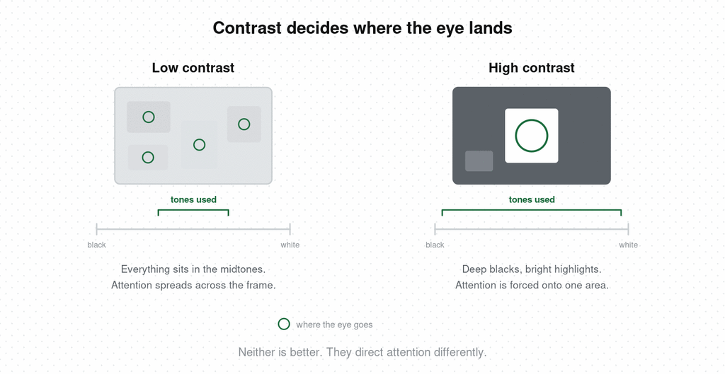
The consequence that matters more than the aesthetic: contrast decides where the eye lands. A high-contrast frame forces attention onto one bright area. A low-contrast frame gives every part of the image roughly equal weight and hands the choice back to the viewer.
I adjust contrast on nearly everything I shoot, and over the years I’ve ended up pushing most of it down.
Low contrast with the saturation pulled back, a faint haze, a little softness that isn’t quite sharp — that combination imitates what your eye does in an actual room. Human vision doesn’t crush blacks. Walk into a dim space and you can still see into the shadows; nothing goes to solid black the way a camera makes it. So a low-contrast frame reads as being somewhere. A hard, punchy grade reads as having been photographed.
That’s my preference, and it’s worth naming as one. What sits underneath it applies to any grade you choose: every contrast decision is a claim about what you want the viewer to feel, and the ones that land are the ones where the claim was made on purpose.
This is where contrast stops being decoration and starts doing a job in the first frame.
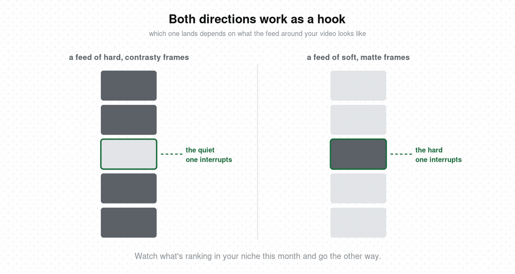
Push it up hard and the opening frame survives compression, survives a small thumbnail, and survives being seen for a third of a second. One bright area, one dark surround, nowhere else for the eye to go. If you’re putting text on that first frame, high contrast is what keeps it legible.
Push it down hard and you get the opposite mechanism. A feed full of saturated, punchy, over-graded frames makes a soft matte one land as an interruption. It reads as calm in a place with no calm in it, and calm is unusual enough on a short-form feed to buy you a second.
Which one works depends entirely on what the feed around your video looks like. Watch what’s ranking in your niche this month and go the other way.
There’s a two-second test for either version. Export the first frame, shrink it to about the width of your thumb, and look at it. If you can still tell what the video is about, the contrast is doing its job. If it turns into a soft grey rectangle, push it up until it doesn’t.
Somewhere in your feed is a video whose grade is exactly the thing you’ve been trying to describe. Hookova is built for that: save any TikTok, Reel, or Short in one click, then analyze the one you want and get it broken down piece by piece, so a look you liked at 2am is still there — and explained — when you sit down to edit.
Grading advice usually stops at adjectives. Here’s the control that does the work in each case.
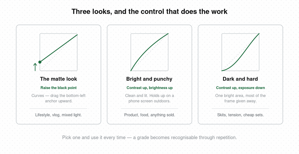
The matte, hazy look. Raise the black point. In a curves panel, drag the bottom-left anchor upward — the darkest part of the image lifts off pure black and the whole frame gains that faded, filmic haze. Dragging the contrast slider down instead pulls your highlights with it and you get grey. Pair it with saturation down a little and a touch of warmth. One warning: large smooth areas like sky or a white wall can band visibly once the platform compresses your upload, so check a low-contrast grade on a phone before you commit to it.
Bright and punchy. Contrast up and brightness up together. Everything is clean, lit, high-key, slightly unreal. It’s the right call for product and food, where the viewer needs to see the thing clearly, and it holds up on a phone screen outdoors in daylight.
Dark and hard. Contrast up, exposure down. Deep shadows, one bright area, most of the frame given away. Skits and anything with tension live here, because it hides most of a cheap set for free.
Whichever you pick, use the same one every time. A grade becomes recognisable through repetition, and a grade nobody recognises is doing half its job. Note that a colour filter can’t fix your lighting — if the light was wrong on set, fix that first and grade afterwards.
Personal brand and lifestyle. The matte look is yours, and it’s the most forgiving of unplanned shooting conditions. It smooths over mixed light and makes a room look lived-in.
Products, UGC, anything that gets sold. Contrast has a floor here. A hazy grade makes fabric texture and colour vanish, and a viewer who can’t see the product doesn’t buy it. Grade for clarity, then check the real object against your screen.
Skits and short drama. Contrast is an emotional control. Move it between scenes on purpose, and let the flat, open look carry the ordinary moment so the hard grade means something when you cut to it.
Faceless and multi-account. Build one grade, save it as a preset, apply it to everything. Footage from five different sources looking like one channel is most of what makes a faceless account feel like a real account.
There’s no correct contrast setting. There’s only what you’re trying to say, and whether you said it strongly enough for anyone to notice. A style is worth having when it’s a decision. Strong intent produces strong work, and it’s usually visible in the first frame.
What does low contrast mean?
Low contrast means the difference between the brightest and darkest parts of an image is small. Shadows stay open and detailed, highlights stop short of pure white, and most of the picture sits in the midtones. The result looks soft, flat, and calm.
What’s the difference between low contrast and high contrast?
High contrast has deep blacks, bright highlights, and a fast transition between them, which pushes the viewer’s eye to one area. Low contrast keeps everything closer together in brightness, which spreads attention evenly across the frame. Neither is better; they direct attention differently.
How do you make a video look faded or matte?
Raise the black point. In a curves adjustment, drag the bottom-left anchor upward so the darkest tone lifts off pure black. Lowering the contrast slider pulls your highlights down at the same time and leaves the image flat and grey. Reduce saturation slightly and add a little warmth to finish the look.
Is low contrast good for video?
It suits lifestyle, vlog, and atmospheric content, and it handles mixed indoor lighting well. It works poorly for product footage, where texture and colour accuracy matter, and for outdoor viewing, where a low-contrast image is hard to read on a bright phone screen.
Does low contrast affect video quality?
It can. Low-contrast, low-saturation images have large areas of similar tone, and platform compression sometimes turns those smooth gradients into visible bands, especially on skies and plain walls. Check your export on a phone before publishing.
What is a matte look?
A matte look is a grade where the blacks are lifted so nothing in the frame reaches pure black, producing a soft, slightly hazy, film-like image. It’s the most common form of a deliberately low-contrast style in short-form video.
Contrast is one decision inside a first frame that has to make several at once — framing, where the text sits, what the first line does, where the eye goes. Hookova breaks a finished video down second by second so you can see all of them in the videos already working in your niche. For the full range of opening techniques it recognizes, see the video hooks guide.
 Hookova